雖然還沒有完成,但是所有看見過這所學校的人都一致同意~~這應該是全世界最漂亮的小學校園。它的地點在哪裡?當然是在充滿藝術氣息的法國囉!
這所位於巴黎市郊的Saint-Denis鎮的小學名叫 Niki-de-Saint-Phalle。
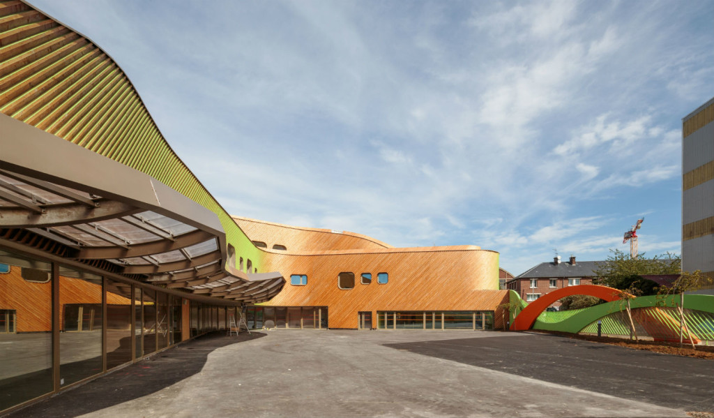
建築師 Paul le Quernec 說,兩個半圓的設計靈感來自人類的左右腦,象徵著小朋友的學習和成長。
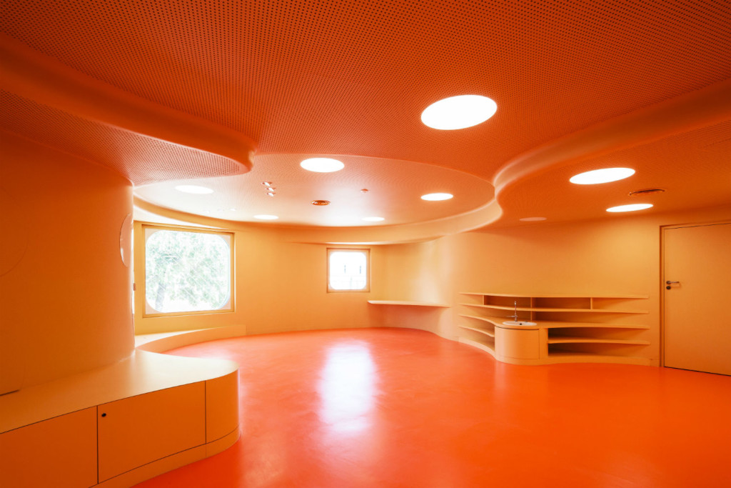
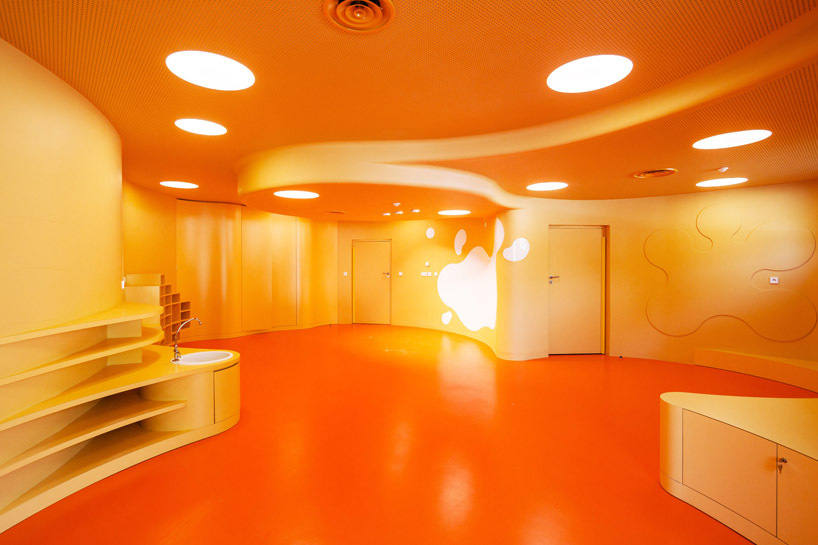
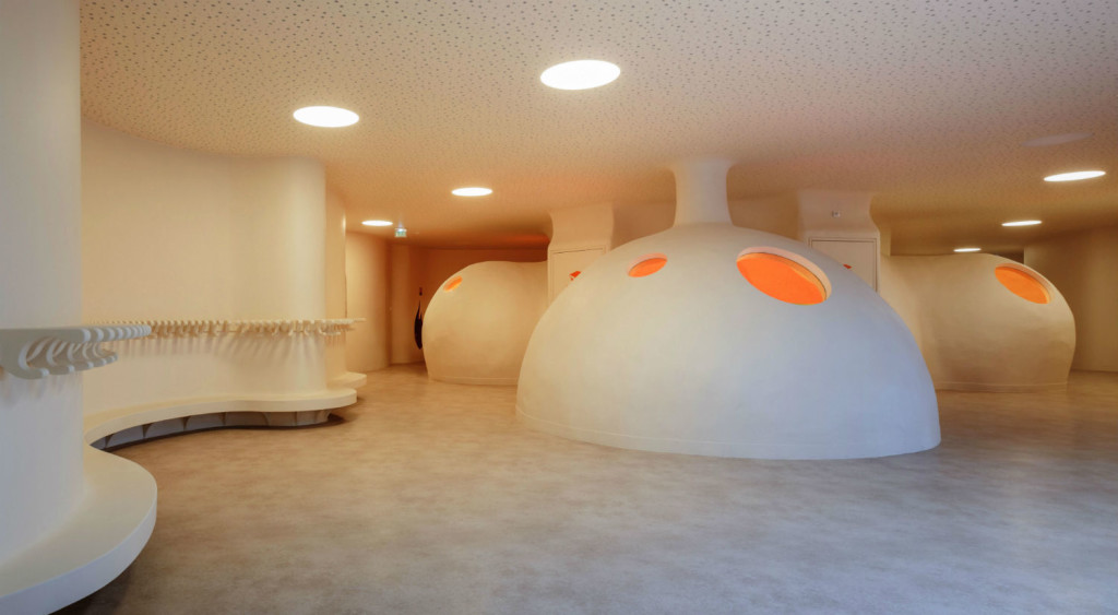
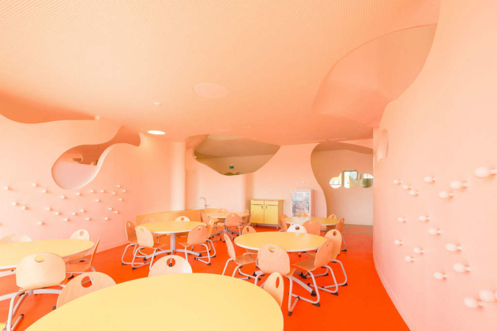
暖暖的木頭色系搭配橙色的地板,加上無角設計,給幼兒園生一個靈活又多變的空間,而且橙色對2-6歲兒童是特別有刺激學習的效果。
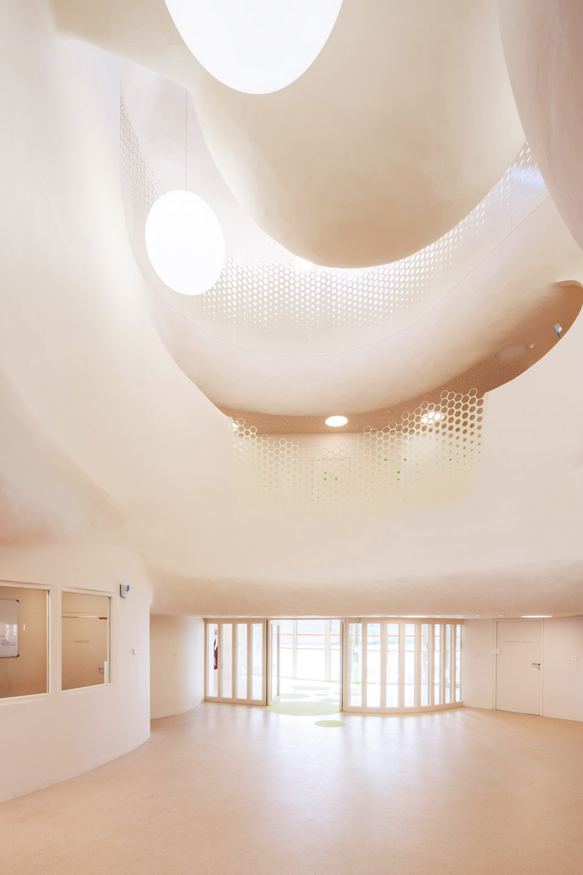
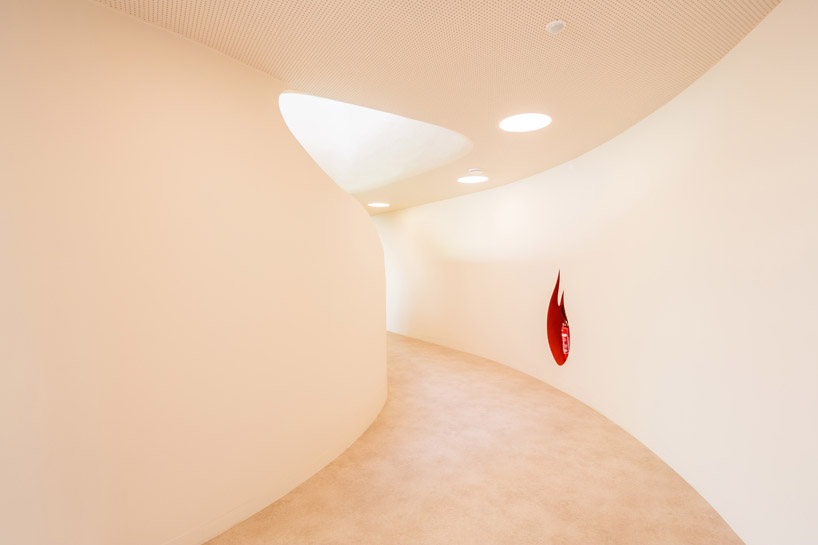
而小學部則是柔和的綠色系,配以白色的弧形牆壁和大量自然光,連滅火器的儲存都是火焰形的。。。在這個充滿細膩心思設計的學校上課,小朋友實在是太幸福了!
ALONG A LITTLE road in a suburb of Paris is a very unusual elementary school. The Niki-de-Saint-Phalle school in Saint-Denis looks nothing like the squat, brick buildings where many of us spent our early years. On the contrary, with its undulating shapes and warm wood tones, this is the most beautiful elementary school I’ve ever seen.
Paul le Quernec, a French architect known for his use of unorthodox colors and shapes, is the man behind the Saint-Denis school, which is a joint space for nursery- and elementary-aged children. Le Quernec explains that the school is modeled after the two hemispheres of the human brain, which is meant to be an architectural metaphor for how children of different ages learn. “For the younger ones, education is focused on children arousal with a lot of little group activities in corner places,” he says. “And for the other, education is more focused on structured learning.”
It’s almost as though Le Quernec approached the two separate wings as completely different projects. The rooms in the nursery wing feature softly rounded shapes and a warm orange hue to prompt stimulation in children between two and six years old. The elementary-aged children attend classes in angular rooms that have been painted a soft green color, to encourage concentration. When asked if he applied any research to the shapes, colors and textures of the space, he replied, “My answer will be considered as very pretentious or very irresponsible, but the truth is that I draw these spaces with my intuition and my childhood memory.” But it’s not all high-minded associations—this arrangement, Le Quernec explains, has practical considerations, too. “The elementary classroom need a defined number of tables and chairs, good views of the blackboard, and neutral space to further pupils’ concentration,” he says.
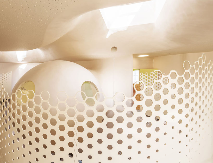
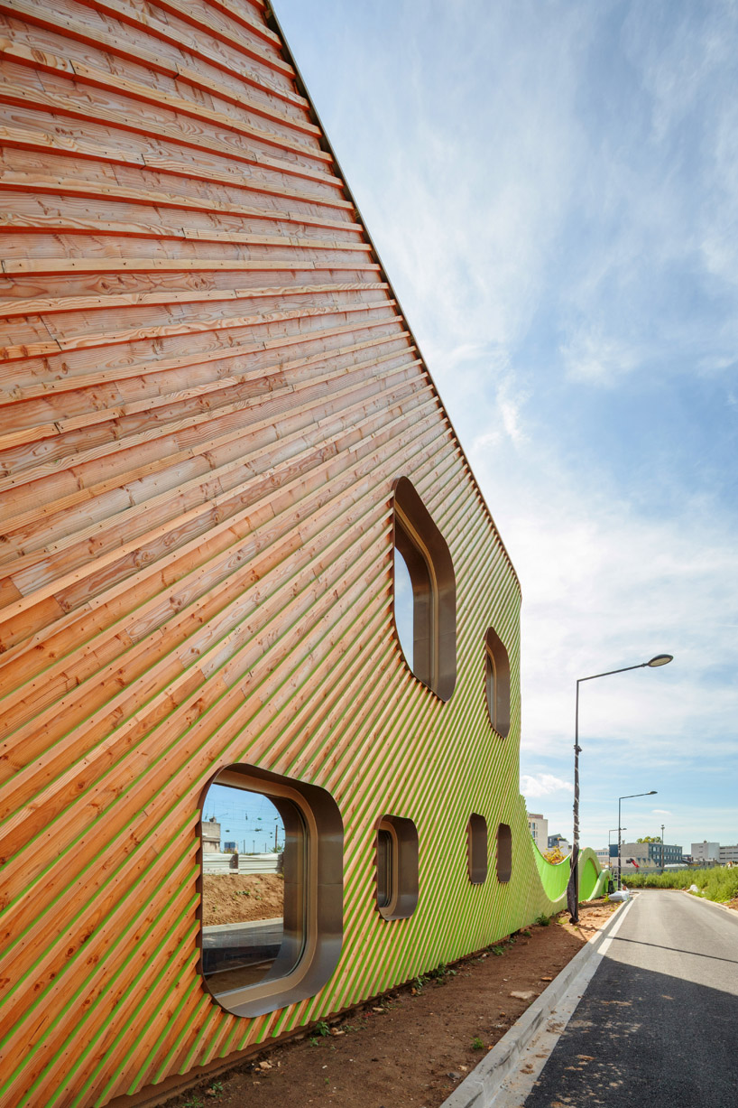
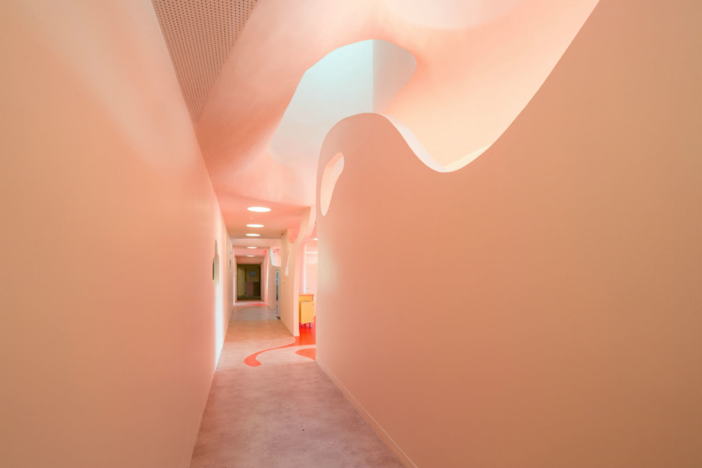
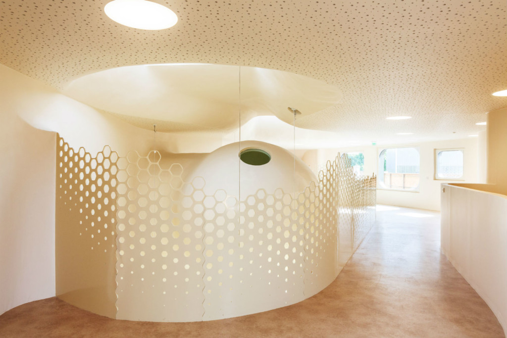
Still, the building is full of playful visual trickery. The exterior of the building, for example, is iridescent in a way that’s reminiscent of a butterfly’s wings. From head-on, the building looks like a natural wood, but from an angle, the facade takes on a green and orange coloration. Inside, le Quernec designed rounded reading pods in the library and crafted a main corridor in a soft pink hue. He says he stays away from the quintessential “Rubik’s cube” coloring of nurseries and grade schools because he thinks “mono-colored space is good to restore a kind of visual balance.”
The materials le Quernec uses—in this case, mostly timber and concrete—are simple, but he explains that he prefers to rely on shape and light to give his buildings richness. As he puts it: “Golden walls will never enrich the space.” And indeed, you can see this aesthetic echoed in le Quernec’s other buildings. The school in Saint-Denis feels like a cousin to the nurseries le Quernec designed in Boulay and Sarreguemines, France, which are also built around airy, tent-like volumes and Pantone-colored rooms. The schools seem to hit a perfect balance: They’re just weird enough to keep children engaged on a daily basis, but they’re also sophisticated enough to make adults (read: me) jealous that we can’t go back to school.

